
Hero 15 block design & features
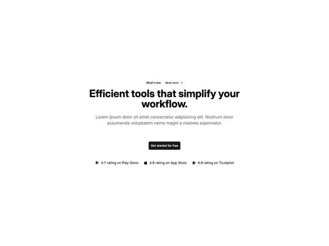
Hero15 centers everything inside the container using shadcn/ui badge and button styling: an outline badge behaves like a changelog teaser with divider, trailing arrow, and link styling from shadcn/ui, followed by a balanced headline, muted paragraph, and one large primary button carrying a soft hover shadow lift.
Beneath the CTA, a wrap-friendly list pairs recognizable marketplace glyphs with concise rating sentences so mobile readers still scan proof without horizontal scrolling.
The presentation stays lightweight, relying on typography scale jumps rather than imagery, which suits mobile product launches or signup-focused landing intros.
Spacing tightens the headline-to-body gap while letting the proof row breathe with larger top margins on wide layouts.