Hero 28 block design & features
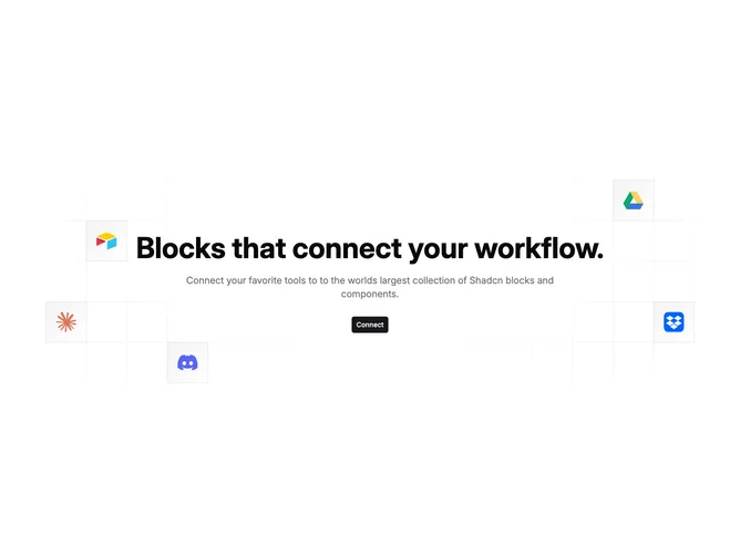
Hero28 follows the familiar integrations pattern from Shadcn UI marketing pages: props supply heading, supporting copy, button targets, and an icon list that seeds decorative tiles rendered inside a wide illustrative mesh hidden on small screens.
Centered text keeps attention on messaging while the illustration implies ecosystem breadth without listing partners in prose.
Palette-wise the diagram leans on neutrals with accent-filled squares cradling each logo glyph so brand marks stay legible against line art.
Because the artwork hides below large breakpoints, mobile readers experience a straightforward headline-first hero and still get the CTA immediately.