Hero 25 block design & features
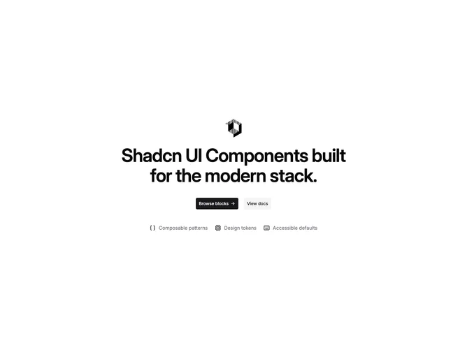
Hero25 is a centered hero from shadcn/ui with generous vertical padding, optional logo, uppercase-style eyebrow text, and a display headline. Two large CTAs sit side by side on wider breakpoints. Under the buttons, a horizontal wrap row lists up to three short feature phrases, each prefixed with a small icon in the primary color.
The composition keeps attention on the headline and buttons while the icon row reads as quick credibility chips rather than long explanations. Spacing is open, with the chip row acting as a soft footer to the hero band.
This is a simple to moderate block: copy and icon choices drive most of the character, and the responsive flex row needs short labels to avoid awkward wraps.