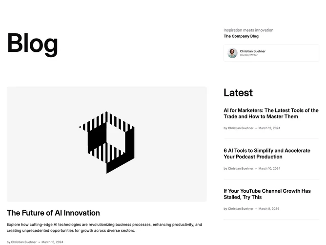
Blog 26 block design & features
Blog26 is a magazine-style feature section built with Shadcn UI, led by a very large masthead heading. To its right, a narrower column holds a muted description with a bold label line beneath and a bordered author card showing a round avatar, name, and role. The content below repeats the same wide-and-narrow split: the lead post has a 16:9 cover, large title, summary, and a byline with linked author name and date, while the right column carries a subheading over three text-only posts, each a title with author and date.
Typography does most of the work here. The masthead dwarfs every other element, and the meta follows a clear step from a medium-weight author name through a faint dot separator to a muted date. The only drawn surface is the thin-bordered author card; elsewhere, hairline rules divide the list items, with no rule after the last one. Covers dim slightly on hover, and titles and author names underline. Nothing animates.
It reads like the front page of a company publication, with the masthead lending a print-inspired identity that the standard heading sizes in sibling blocks lack. The text-only sidebar keeps the image count down to a single cover and one author photo, so complexity is moderate and mostly about writing: titles, authors, and dates for the list plus a lead summary.
Below large screens both rows stack: the masthead sits above the tagline and author card, and the lead story sits above the latest list. On desktop the right column holds a fixed, narrower width so the masthead and lead image get the extra room.