
Blog 110 block design & features
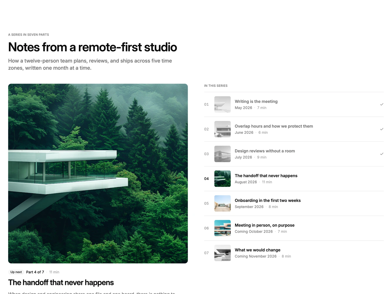
Blog110 is a featured series layout built with shadcn/ui Badge and Button components. A header with an uppercase label, large heading, and description sits above two columns. The left column features the next part to read with a large square image, an Up next badge, its position in the series, read time, a large linked title, a full summary, a read button, and the author's avatar and name. The right column is a numbered contents list where every part has a square thumbnail, linked title, month of publication, and read time.
In the contents list, parts already read are greyed out with a desaturated thumbnail and a check at the end of the row, the featured part's number is set in full contrast, and parts still to come keep full color but lose their links. Rows are split by hairlines with a rule above the first. Surfaces are flat and the featured image carries most of the visual weight.
This pairs a magazine lead story with a book's table of contents, which suits a monthly essay series. Complexity is moderate and content-driven: each part needs a square image, title, summary, date, read time, and status, and the featured part is chosen automatically from those statuses.
Below large screens the featured part stacks above the contents list.