
Blog 112 block design & features
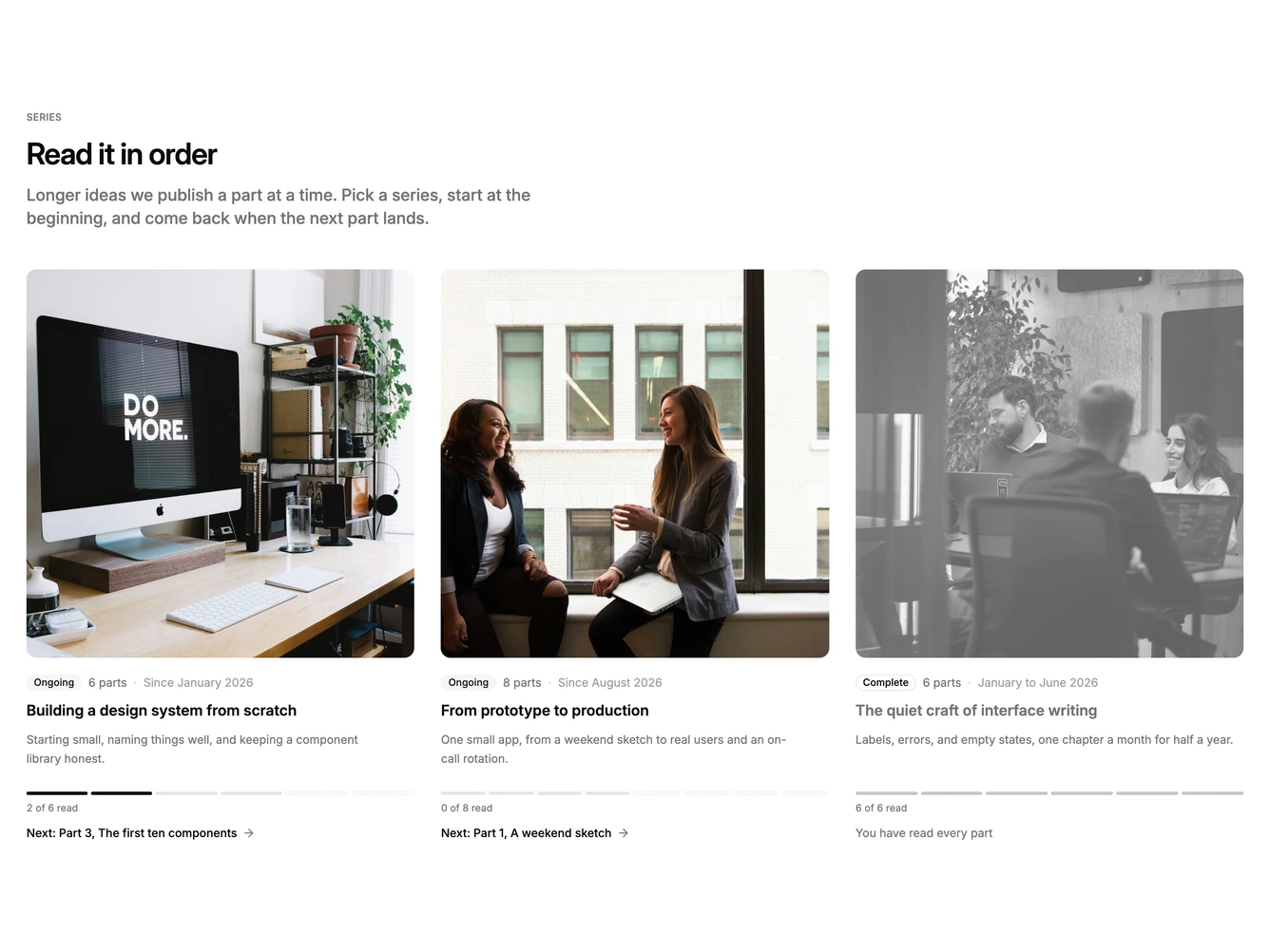
Blog112 is a series library built with the shadcn/ui Badge component. An uppercase label, heading, and description sit above a three-column grid, where each series has a square cover image, an Ongoing or Complete badge, a part count, its start date or date range, a linked title, and a short description. The bottom of each card shows a segmented progress bar, a parts-read count, and a link to the next part by number and title.
The progress bar has one segment per part. Read parts fill in solid, published but unread parts are hairline grey, and planned parts are drawn as dashed outlines, so you can see at a glance how far along a series is and how much is still to be written. A series you have finished is greyed out, with a desaturated cover and a muted title. The cards are flat, with rounded covers and no borders.
This is a fresh pattern for a blog's series hub, closer to a reading app than a post index. Complexity is moderate: each series needs a square cover, description, and a list of parts with titles and statuses, and the progress, next link, and finished state are all calculated from those statuses.
The grid drops to two columns on tablets and one on phones.