Blog 68 block design & features
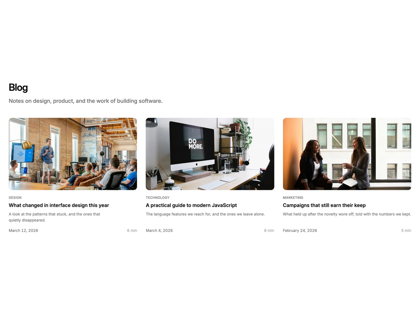
Blog68 is a one-row article strip built with shadcn/ui, showing exactly three posts beneath a heading and a supporting description. Each card stacks a 16:9 cover photo, an uppercase category label, the title, an excerpt clamped to three lines, and a footer with the date on the left and the read time on the right.
There is no card surface at all: no border or background, only the rounded photo frame, with wide gutters keeping the three columns apart and a large gap separating the row from the intro. Type stays modest, with a semibold title over a muted excerpt, a muted date, and a lighter read time. The cover dims slightly on hover and the title underlines when pointed at. There is no entrance animation.
A minimal, airy editorial row and a very standard pattern. What distinguishes it within the family is the hard three-post cap and the longer three-line excerpts, which give each post more room than the denser grids allow. Simple and content-driven: three cover images, categories, and short summaries.
Three columns on large screens. At medium widths it becomes two columns, which leaves the third post alone on a second row, and phones get a single column.