
Blog 96 block design & features
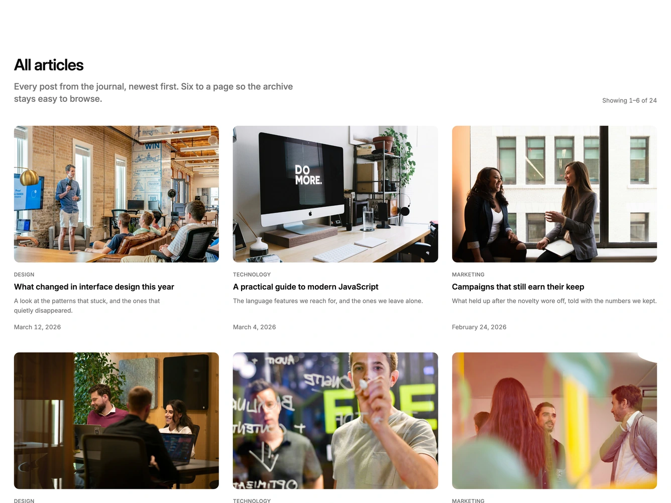
Blog96 is a paginated article archive built with the Shadcn UI Pagination component. A heading and description sit on the left with a "Showing 7 to 12 of 24" range label aligned to the right, followed by a three-column grid of six cover cards. Each card has a three by two cover photo, an uppercase category, a linked title, a two-line excerpt, and a date pinned to the bottom. Numbered page links with previous and next buttons sit centered under the grid.
The cards are chromeless, with rounded covers on a muted frame, generous gaps, and a quiet hierarchy that steps from a small uppercase label to a semibold title and muted summary. Changing page swaps the six cards in place and scrolls the section back into view. The active page carries an outline button treatment, the disabled end control fades, and long archives collapse into an ellipsis on either side of the current page.
It reads as a calm, conventional archive page, a dependable pattern that most blog indexes need and that pairs well with filter or search blocks above it. Complexity is low to moderate: the page size and starting page are props, and the block needs a long list of posts with cover images, categories, and dates to show more than one page.
The grid drops to two columns on tablets and one on phones, and the previous and next labels shrink to arrows on the smallest screens.