
Blog 15 block design & features
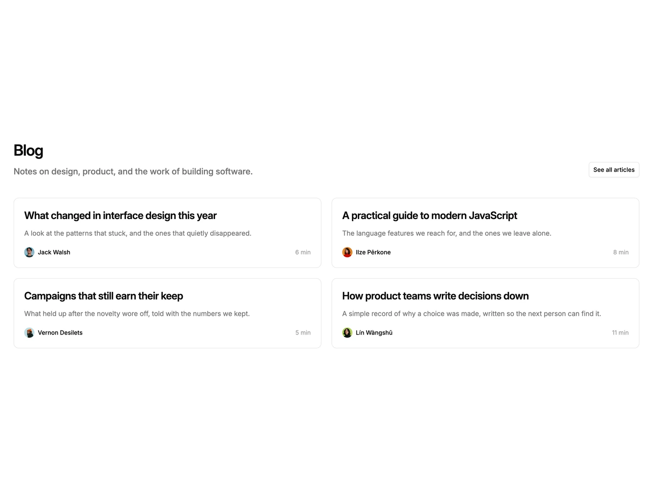
Blog15 is a two-column card grid built with a Shadcn UI Button. The header pairs a heading and intro paragraph on the left with an outline browse button on the right. Four posts follow in a two-by-two grid of bordered cards, each containing a large linked title, a three-line excerpt, and a footer row with a small round avatar and author name on one side and the read time on the other.
The cards are flat, with a thin border, rounded corners, and roomy padding on the plain page background. Titles are the largest in this set, semibold and tightly tracked, while the read time drops to a fainter muted tone than the excerpt. Footers are pinned to the bottom of each card so bylines align across a row. Only the title responds to hover, with an underline; the card outline stays put.
Outlined cards with bigger type make this the most substantial of the minimal grids, closer to a classic card index while still image-free. It feels composed and readable rather than dense. Complexity is low, with content needs of four excerpts plus author names, avatars, and read times.
On mobile the header stacks with the button below the intro, and the cards fall into a single column.