
Blog 67 block design & features
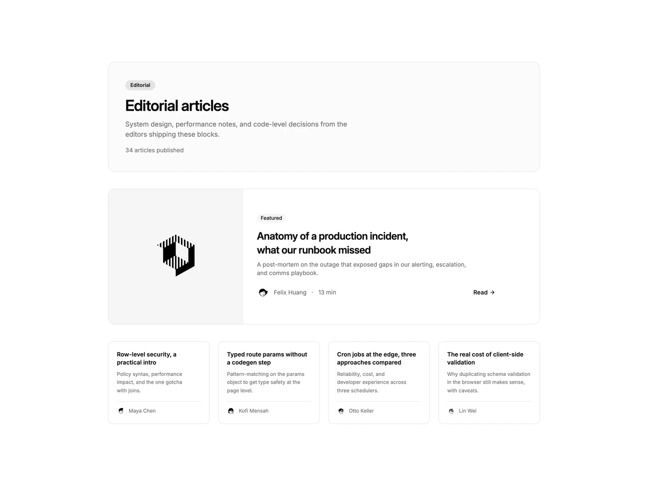
Blog67 is a featured-plus-grid listing built with shadcn/ui Badge and Button. A split featured card pairs a cover image with a featured badge, title, excerpt, avatar, read time, and ghost read button. Four supporting cards sit in a row with title, excerpt, avatar, and a hover arrow.
Featured and grid cards share bordered shells. Hierarchy comes from the split story, then the compact grid, without an extra category intro panel.
This is a moderate magazine well rather than a full category landing. Complexity is mixed: layout is CSS-driven while content needs several posts with one marked featured.
On smaller screens the featured image stacks above the copy and the four-up grid drops to two columns, then one.