
Blog 40 block design & features
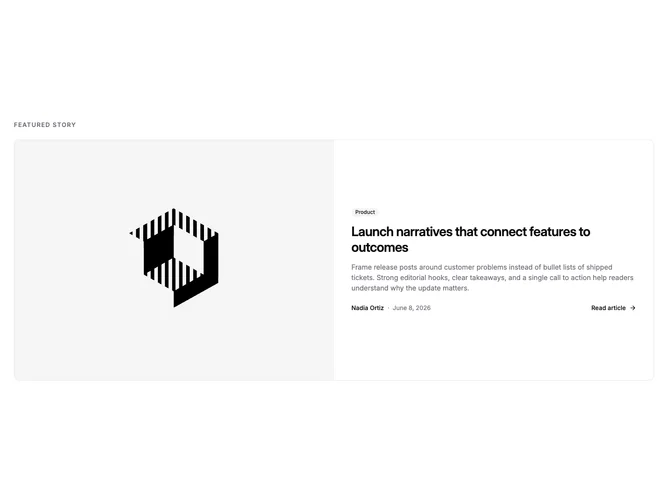
Blog40 is a single featured post rendered as one bordered card, built with shadcn/ui. The card splits into two equal columns: a 4:3 cover image flush to the left edge and a text panel with a category badge, large title, and summary. A footer row places the author and date on the left and a read link with an arrow on the right.
The card is the only surface, with a thin border, rounded corners, and no shadow. The image bleeds to the card edges and the text panel is padded and vertically centered. Meta moves from a medium-weight author name to a muted date, and the read link is set in medium weight with a gray arrow. Hover dims the cover and underlines the title; the read link underlines and its arrow darkens. Nothing animates.
Minimal and direct, this is the simplest block in the family and a self-contained version of the featured card pattern that can sit on its own between other sections. It needs only one image and one post's worth of copy.
Below large screens the card stacks the image above the text, and the footer row wraps so the read link drops beneath the byline when space runs out.