

Blog 11 block design & features
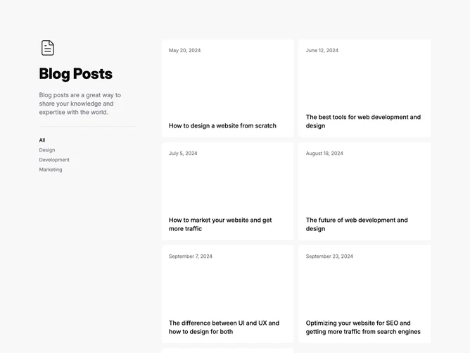
Blog11 is a split blog section built with shadcn/ui, pairing a sticky intro column with a two-column grid of six tall tiles. The intro stacks a large heading, a muted description, a Separator rule, and a short list of uppercase category links, with the first category shown as active. Each tile holds a date at the top and a title at the bottom. The first tile always shows its cover photo behind the text, while the rest reveal theirs on hover or keyboard focus.
The whole section sits on a soft muted band, and the tiles are rounded, borderless panels in the page background color, so they read as light cards against the gray. Idle tiles show a semibold title over a muted date. On hover the darkened photo fades in and both lines switch to light text in a slow cross-fade. Each tile is a single link and a single hover target, and the gaps between tiles are even and moderate.
Editorial and quiet, with the hover reveal doing all the work. Text-first tiles that turn into photo cards are uncommon among blog grids, which makes this the most interactive block in the two-column set without needing any script. Complexity is moderate and image-driven: every post still needs a cover photo for the hover state, plus a set of category labels.
Below the large breakpoint the intro stops sticking, centers above the grid, and the category links wrap into a horizontal row. Tiles are a single column on phones and two columns from the medium breakpoint. Titles clamp to two lines so the fixed tile height holds.