
Blog 41 block design & features
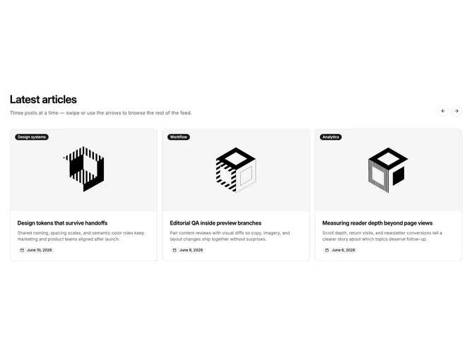
Blog41 is a blog carousel built with shadcn/ui Carousel, Button, and Badge components, kept inside the page container. The header pairs a heading and description with two round outline arrow buttons on the right. Each slide is a bordered card with a 16:9 image, a filled category badge in the top-left corner of the image, a title, a two-line excerpt, and the publish date in a soft pill with a calendar icon.
Card surfaces are light with hairline borders and rounded corners that clip the image to the top. Contrast comes from the dark category badge on the photo and the gray date chip at the foot of the card. Text stays muted below a semibold title, and cards are spaced evenly in the track. The image dims slightly on hover and the title underlines separately. Static otherwise.
A tidy, contained alternative to the full-width carousel, with a stronger badge presence thanks to the date chip. It is a common pattern executed without decoration. Moderate content needs: up to six posts with images, categories, summaries, and dates.
Shows one card on phones, two on small tablets, and three on desktop. The track loops, so the arrows never disable, and slides can also be dragged or swiped.