
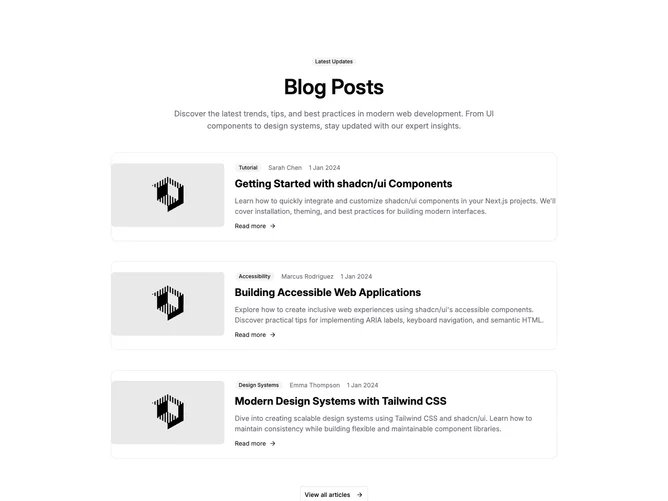

Blog 24 block design & features
Blog24 is a three-post blog row section built with shadcn/ui Badge, Card, and Button components, finished with a centered outline button and arrow that links to the full archive. A left-aligned heading and description open the section. Each row places a fixed-width, rounded 16:9 thumbnail on the left and a text column on the right: a meta line with a secondary category badge, author, and date, then a linked title, a summary, and a "Read more" link with an arrow.
Spacing does the separating here, with wide open gaps between rows and no rules. The filled secondary badge is the one soft chip in the meta line, followed by a medium-weight author name, a faint dot, and a muted date. Titles are semibold and summaries relaxed and muted, so each row reads top to bottom with a clear step down in weight. Hovering the thumbnail dims it slightly, the title underlines on its own, and the read-more arrow darkens. Nothing animates on entrance.
This is the most conventional take in the row family: a balanced thumbnail-beside-text pattern with a closing call to action, and nothing unusual layered on top. Complexity is low; each post needs a landscape image, category, author, date, title, and summary, plus a URL for the footer button.
On phones the thumbnail spans the full width above the copy and the footer button stretches edge to edge. From small screens up the thumbnail holds its fixed width while the text column takes the rest. Post and button links open in a new tab by default.