Blog 21 block design & features
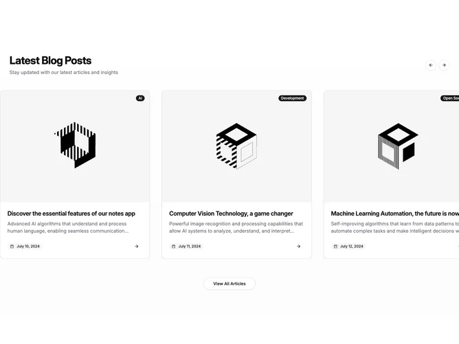
Blog21 is an interactive carousel strip built with Shadcn UI Carousel, Button, and Badge components. The section uses a subtle vertical gradient from background into a muted tint, then introduces the block with a heading, short supporting line, and paired circular outline arrow buttons that trigger previous and next carousel moves while disabling when no further slides exist. Each slide is a bordered rounded card with shadow on hover: an aspect-ratio image area carries an absolutely positioned topic badge, while the body clamps the title and summary to two lines each and finishes with a rounded secondary badge that shows a calendar icon beside the date plus a ghost circular arrow affordance.
Cards lift slightly on hover through shadow growth and the cover image scales up inside its frame, which keeps motion confined to media and chrome rather than typography shifts.
Overall the block emphasizes imagery, chips, and carousel controls in one horizontal band. Looping playback and freer dragging on narrow breakpoints make browsing feel continuous compared with a fixed grid.
A centered large outline “View All Articles” button sits below the track as a secondary path out of the carousel. Expect moderate implementation complexity from carousel state wiring and image assets per slide; width calculations also bleed the track slightly at very wide screens for a runway-style presentation.