
Blogpost 23 block design & features
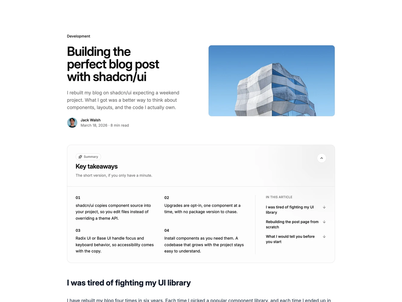
Blogpost23 is a split article header with a summary card, built with shadcn/ui Avatar and Collapsible components. The top row places the category, headline, summary, and author byline with date and read time on the left beside a landscape image on the right. Under it, a summary panel the full width of the header shows a small eyebrow, a key takeaways heading and a one-line description, then four numbered points in two columns beside an in-this-article list linking to each section. The prose body runs at the same width.
The panel uses a faint muted fill with a soft glow in one corner, a hairline border, and larger rounding than the rest of the page. Points are numbered with two-digit primary figures, and the section list sits behind a vertical rule with arrows that nudge down on hover. It opens by default and folds away from a round chevron button. Type stays restrained so the headline and the summary card do most of the work.
A summary card at the top of a post is common on news and documentation sites. This one combines it with section shortcuts, so a reader can skim the points and jump to the part they need. Complexity is moderate. It needs a short list of takeaways written for the article and a landscape image.
On smaller screens the image stacks under the title, the takeaways become a single column, and the section list moves under them.