
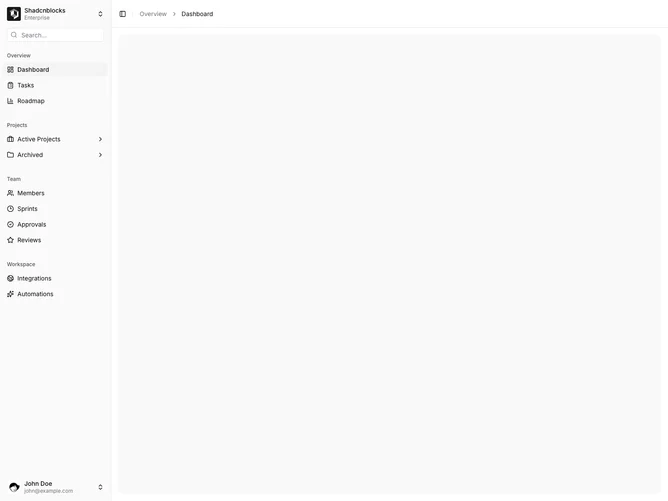
Sidebar 14 block design & features
Sidebar14 is a left-rail app shell built with shadcn/ui. Workspace switcher and search sit in the header. Grouped links fill the body. Items that have children keep a trailing chevron and, on click, open a slide-out panel attached to the right edge of the rail. The panel has a back control, the parent label, and a list of child links with icons. A user footer with avatar and account menu stays on the main rail.
What you see is a second column sliding in from the rail: hairline left border, light surface, and a short drop shadow. The panel matches the sidebar height and sits over the main canvas. The primary rail stays compact because nested items never expand in place. Aside from the slide, the chrome is the default sidebar palette.
The mood is console-like and a bit more spatial than inline collapse. Opening a sibling panel instead of indenting rows is a distinctive pattern in this set. Complexity is moderate and mixed: the panel motion is code-driven, while the menus still need a real nested tree plus workspace and user data.
The slide-out covers the left side of the content pane until it is dismissed. The main header still shows the collapse trigger and breadcrumbs.