
Sidebar 11 block design & features
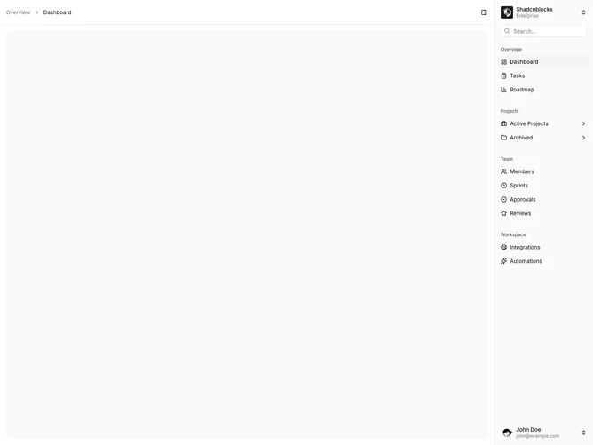
Sidebar11 is a right-docked app shell built with Shadcn UI. The main column comes first in the layout and the sidebar sits on the trailing edge. The rail still opens with a workspace switcher and search, then the same labeled groups and nested project links, then a user footer. The header puts breadcrumbs on the left and the collapse trigger on the right, flipped so it points toward the rail.
Visual treatment matches the default sidebar: muted labels, compact rows, a quiet search field, and a highlighted active item. The header has a hairline bottom border instead of a vertical rule beside the trigger. The user menu opens upward from the footer so it stays on screen. Density is the same as the left-rail variants.
In terms of style this is still shadcn-default chrome. What stands out is placement, not ornament. Docking the rail on the right is an uncommon but simple variation, closer to a tools panel than a primary nav column. Complexity stays moderate and content-driven.
On narrow viewports the parent breadcrumb hides and the trigger remains on the trailing edge of the header.