Sidebar 4 block design & features
Sidebar4 features collapsible navigation groups where entire sections can be expanded or collapsed. Group labels act as toggle triggers with chevron indicators. This allows users to hide sections they don't use frequently while keeping important ones visible.
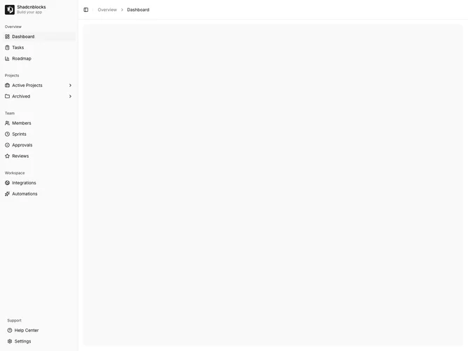
Light background with collapsible group headers. Chevrons rotate when groups expand/collapse. Items within collapsed groups are hidden. Some groups can be set to default open while others start collapsed. Standard sidebar styling with rail support.
This variant provides maximum flexibility for users to customize their navigation view. Useful for applications with many sections where users may only work in a few at a time. The collapsible groups reduce visual clutter.