Product List 2 block design & features
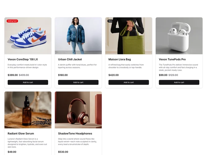
The ProductList2 component displays an elegantly structured collection of product cards, effectively showcasing a variety of items in a visually appealing grid layout. Each product card within this shadcn block offers a comprehensive view, presenting essential product details such as the name, descriptive highlights, pricing information, and promotional badges when applicable. This layout is particularly advantageous for creating an immersive shopping experience, allowing users to quickly scan through the available products and make informed purchasing decisions.
Diving deeper into its design and functionality, the ProductList2 component leverages a combination of layout tools to create a modular and organized display that adapts to different product content. Each card features a high-quality product image, utilizing an aspect ratio mechanism to ensure consistent image presentation. A notable feature is the dynamic badge that can highlight key product statuses, like sales or new arrivals, providing visual cues for users. Pricing is prominently displayed, with differentiation between sale and regular prices, enhancing clarity in a competitive market setting. The shadcn ui infusion is evident in its seamless alignment of UI elements, ensuring a cohesive and user-centric interface. Overall, this component is suited for any e-commerce platform aiming to deliver a refined and efficient product browsing experience.