Product List 10 block design & features
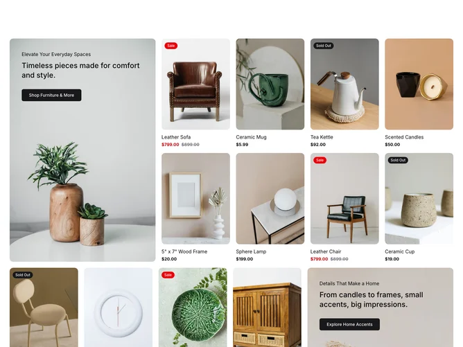
The ProductList10 shadcn component is designed to present a structured and engaging showcase of products and promotions. It leverages a clean design to aesthetically display products alongside featured promotional content, making it an effective tool for highlighting key offerings in a streamlined user interface. The component arranges products within a visually appealing grid format, aligned with a sophisticated promotion card to draw user's attention to featured items or collections seamlessly.
At its core, this shadcn block is organized into sections consisting of a promotional card and an accompanying product grid. Each promotional card accentuates key features and calls-to-action with an eye-catching background and strategic content placement. Meanwhile, the product grid skillfully employs features such as sale badges and quick action buttons, including 'Add to cart' and 'Quick View,' to enhance user interaction and immediacy. Furthermore, the subtle hover effects and the distinct integration of badges based on stock status or sales add functional dynamism to the aesthetic layout, setting it apart from other generic product list components.