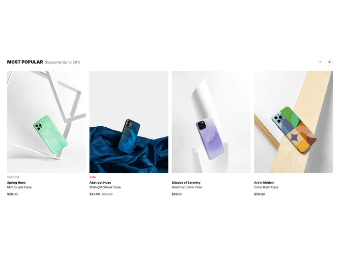
Product List 6 block design & features
The component is designed to display a visually engaging product list using a carousel format, enhancing the presentation of e-commerce items. It incorporates a shadcn ui carousel block to allow users to browse through a selection of products with ease. Each product in the list is shown in a card layout with an image, title, collection name, price details, and interactive options like 'Quick Add' or 'Shop Now' buttons. The carousel's navigation includes discreet pagination bullets and next/previous buttons, providing a seamless browsing experience.
On a more detailed level, this component differentiates itself with its ability to handle variations of products, allowing users to select different colors and visualize their choices immediately through images that update in real-time. It employs structured elements such as shadcn blocks for layout, form management for handling product options, and a system to indicate stock status, giving users an informative and interactive shopping experience. This makes it particularly suitable for showcasing products with multiple variants, while the inclusion of promotional information like sales and discounts adds to its e-commerce capabilities.