Product List 1 block design & features
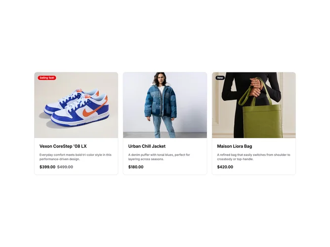
ProductList1 is a meticulously designed component that serves to present a curated selection of products in an engaging and visually appealing grid layout. By leveraging a shadcn ui approach, it ensures that each product is displayed with its key attributes such as name, image, price, and an optional badge indicating promotional items. This component is particularly useful for showcasing a diverse range of items, allowing users to explore offerings seamlessly. The integration of the shadcn block structure offers consistent design and function, elevating its utility in an e-commerce setting.
The component delves into the details with features like customizable badges that highlight product status and a reactivity that provides a dynamic user experience through hover effects. Its shadcn component design ensures each product is wrapped in a card with a structured layout, including an image displayed within a defined aspect ratio and essential descriptive texts, thus maintaining an organized appearance. The pricing section creatively distinguishes between regular and sale prices, offering visual clarity on discounts. ProductList1, therefore, stands out with its focus on structured presentation, effective information dissemination, and seamless integration of utility and aesthetics in a comprehensive product display solution.