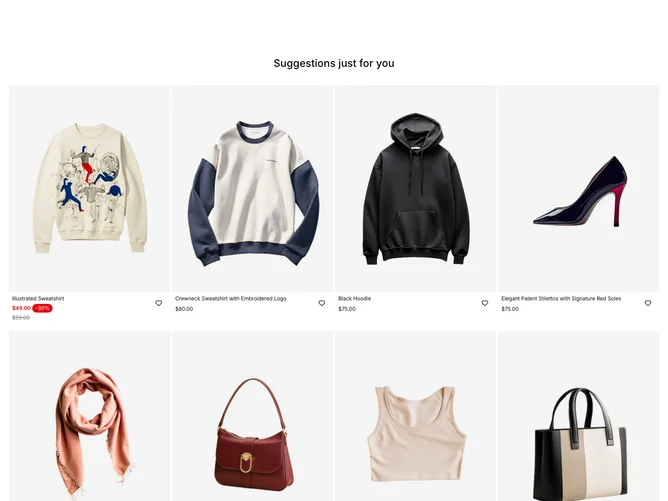
Product List 7 block design & features
The ProductList7 component is a sophisticated e-commerce product listing layout that showcases a variety of products in a visually structured grid format. Each product is represented as a ProductCard, which provides a glimpse into the essential details like product image, name, price, and available sizes. The component efficiently manages product inventory status, indicating stock availability for each size through interactive elements. This integration of elements makes it a versatile solution for displaying a shopping catalog with varying stock conditions.
In more detail, the ProductCard within ProductList7 facilitates user interaction by changing the experience based on device size. On larger screens, users can interact with a hover-based interface for selecting product sizes, enabled by the form integrated with shadcn blocks to handle size selection and inventory status. Features such as tooltips provide intuitive feedback about stock availability, encapsulating user expectations into every hover and click. The ability of the component to cater to both desktop and mobile interactions separately enhances usability and ensures a smooth shopping experience across all devices. The intelligent design uses shadcn UI elements to combine functional elegance with practical e-commerce needs.