Product List 8 block design & features
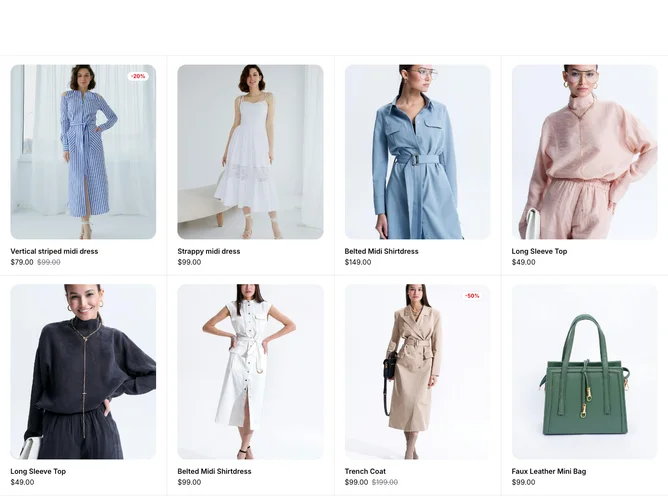
This component serves as a versatile shopping item listing interface, rendering a selection of products in a visually appealing grid. It utilizes shadcn blocks to display essential product details such as images, price, rating, and available options like size and color. Each product entry within this setup is designed to highlight promotional information dynamically, like discounts, and visually engaging transitions ensure that user interactions feel fluid and intuitive.
Diving deeper, the component stands out with its interactive capabilities facilitated by collapsible forms, which present users with customization options such as size and color selection. Upon selection, real-time feedback is provided through visual cues like check marks and color indicators, making it easy to navigate stock levels and choices. Integrated with shadcn ui components, the product cards adopt a cohesive style that aligns with modern design standards, making content engagement seamless. The inclusion of an "Add to Cart" button further bridges the gap between browsing and purchasing, thereby enhancing the shopping experience.