Shadcn Footer Other Blocks

Browse and download 4+ Shadcn UI Footer Other blocks. Built with React, Tailwind and shadcn/ui. These shadcn components are ready to download, copy and paste or install with the shadcn registry.

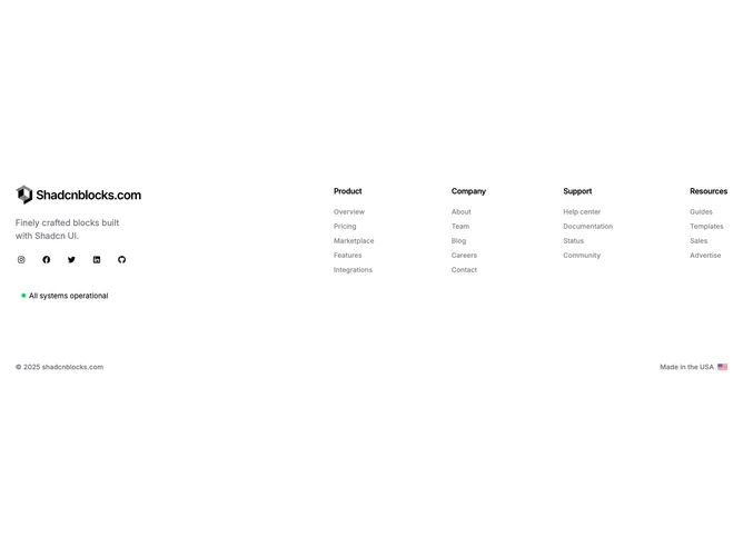
Shadcn Footer 15 - Footer with logo, social icons, status badge, link columns, and country flag

Footer with logo, social icons, status badge, link columns, and country flag

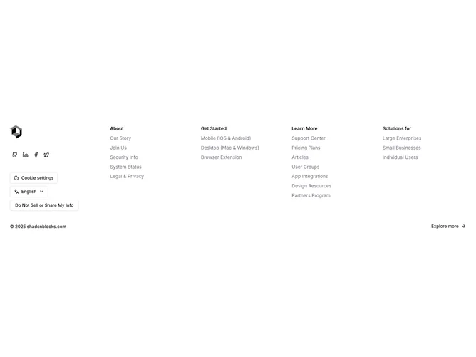
Shadcn Footer 18 - Footer with social icons, cookie drawer, language picker, privacy dialog, and link columns

Footer with social icons, cookie drawer, language picker, privacy dialog, and link columns

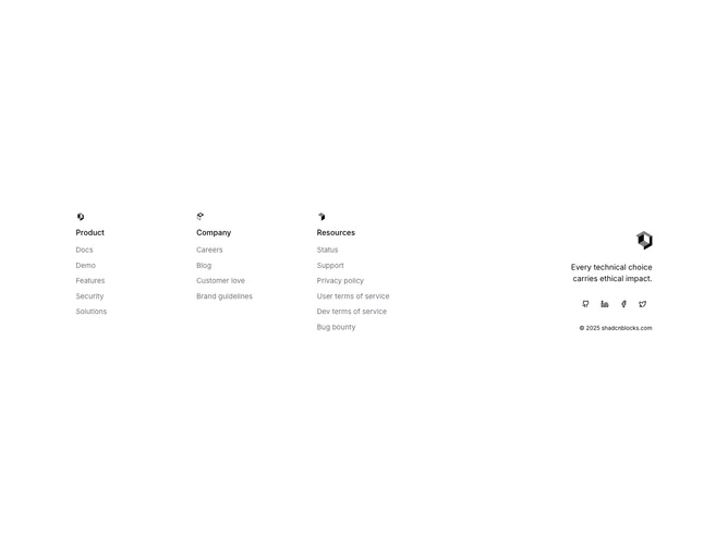
Shadcn Footer 21 - Footer with icon-labeled link columns, logo, tagline, and social buttons

Footer with icon-labeled link columns, logo, tagline, and social buttons

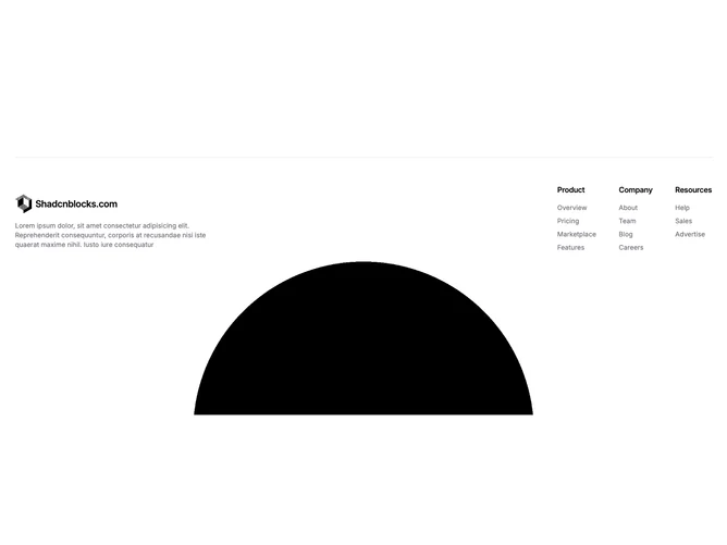
Shadcn Footer 23 - Footer with logo, link columns, and animated globe

Footer with logo, link columns, and animated globe

A shadcn footer other block covers unique and creative footer layouts that go beyond standard patterns. These sections offer distinctive approaches for footer content that doesn’t fit neatly into other subcategories.

Each block is a self-contained React component which you can copy/paste the code or install via the shadcn CLI. You own the code — customize the layout, content, and styling using Tailwind utility classes.