
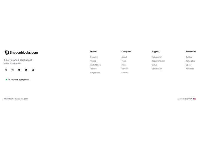
Footer 15 block design & features
The left column holds a logo image, a short description in muted text, a row of social icons, and a shadcn/ui badge showing a pulsing green dot next to "All systems operational." The right side displays navigation link columns arranged with generous gap spacing. At the bottom, a row splits copyright text from a "Made in" label paired with a small country flag image.
The status badge uses a rounded-full border with a nested green dot that pulses via CSS animation, layering a semi-transparent outer ring over a solid inner circle. Social icons use full opacity by default and drop to 50% on hover, reversing the typical pattern. Link text uses foreground color at reduced opacity with a full-opacity hover state, creating an inverted interactive treatment.
The pulsing status badge and country flag add personality to what is otherwise a standard link-grid footer. The generous 32-unit vertical gap between the main content and the bottom row gives the component an airy, well-spaced feel.
On smaller screens the left and right columns stack vertically, and the navigation columns wrap naturally. The bottom row also stacks, placing copyright above the flag indicator.