
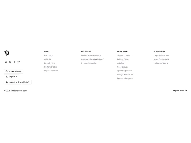
Footer 18 block design & features
The left quarter holds a logo, a row of ghost-variant social icon buttons, and three stacked outline buttons: a cookie settings trigger that opens a shadcn/ui Drawer with toggle switches for cookie categories, a language selector using a DropdownMenu with language labels and descriptions, and a privacy opt-out trigger that opens a Dialog. The right three-quarters contain four navigation columns (About, Get Started, Learn More, Solutions for) with semibold headings and muted hover-underline links. A bottom row carries copyright text and an "Explore more" link button with an arrow icon.
The cookie drawer uses a form with react-hook-form and zod validation, rendering each cookie category as a bordered card with a title, description, and Switch toggle. The language dropdown displays each language with its native label and an English description. The privacy dialog uses a compact content width with a close button. All three interactive elements use the outline button variant for their triggers.
This is the most feature-complete footer in the set, packing compliance tools (cookies, privacy), internationalization (language picker), social links, and navigation into a single component. The three interactive drawers and dialogs keep the surface area compact while offering deep functionality on demand.
On smaller screens the left sidebar and right navigation grid stack vertically, with the four link columns collapsing to a two-column layout.