Shadcn Footer Designer Blocks

Browse and download 5+ Shadcn UI Footer Designer blocks. Built with React, Tailwind and shadcn/ui. These shadcn components are ready to download, copy and paste or install with the shadcn registry.

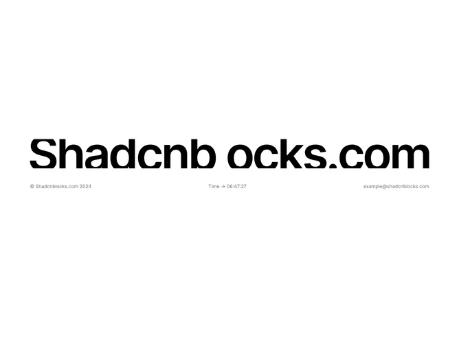
Shadcn Footer 10 - Minimal footer with brand image and live clock

Minimal footer with brand image and live clock

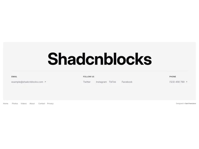
Shadcn Footer 24 - Contact footer with bold heading, email, social links, phone, and nav grid

Contact footer with bold heading, email, social links, phone, and nav grid

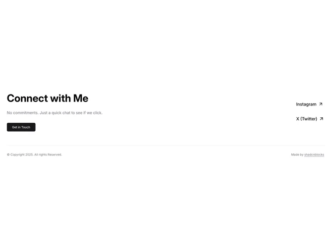
Shadcn Footer 27 - Animated CTA footer with social links and separator

Animated CTA footer with social links and separator

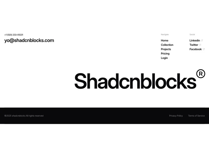
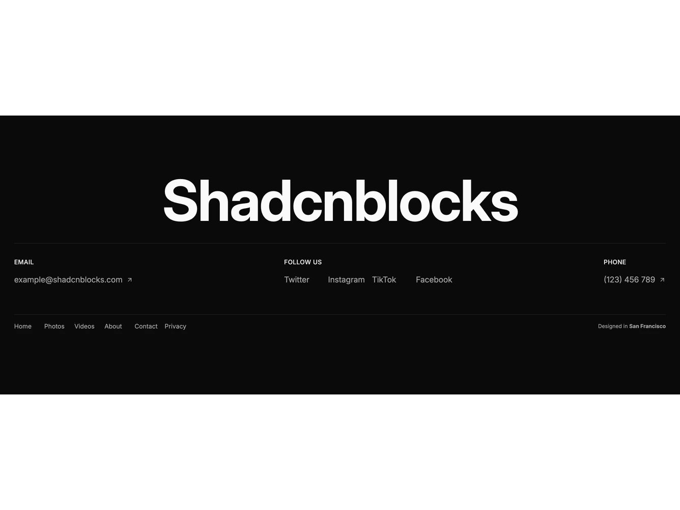
Shadcn Footer 30 - Designer footer with giant brand name, contact info, navigation, and social links

Designer footer with giant brand name, contact info, navigation, and social links

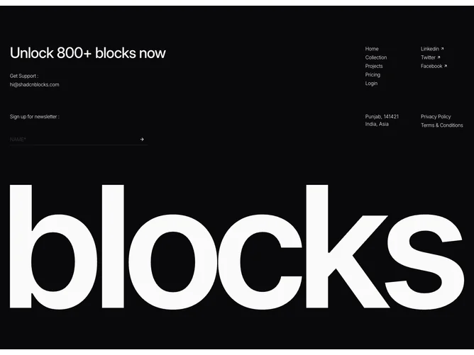
Shadcn Footer 31 - Dark footer with headline, newsletter form, navigation, social links, and animated logo

Dark footer with headline, newsletter form, navigation, social links, and animated logo

A shadcn footer designer block provides a specialized footer layout focused on the designer pattern. It appears on landing pages, product pages, and marketing sites where footer content needs a distinct visual treatment.

Each block is a self-contained React component which you can copy/paste the code or install via the shadcn CLI. You own the code — customize the layout, content, and styling using Tailwind utility classes.