Footer 24 block design & features
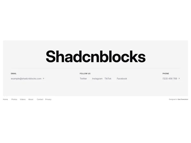
A rounded muted-background card holds a bold heading set at a very large display size (up to 9xl), separated from the content below by a border. Inside the card, three labeled sections sit in a row: an Email section with an ArrowUpRight icon link, a Follow Us section with social link names in a four-column grid, and a Phone section with another ArrowUpRight icon link. Uppercase primary-color labels identify each section. Below the card, a nav grid arranges six page links in responsive columns alongside a "Designed in San Francisco" attribution line.
The heading dominates the card area with extreme font sizing and tight tracking. Section labels use small uppercase primary-colored text, while contact links are set in muted foreground with a primary-color hover transition. The ArrowUpRight icons next to email and phone links reinforce that these are actionable outbound links. The nav grid below the card uses small muted text.
The oversized heading and card-based layout give this footer a portfolio or agency aesthetic, treating the contact information as a featured content block rather than a standard footer element. The attribution line adds a subtle location detail.
On smaller screens the three contact sections stack vertically, the heading scales down through responsive type sizes, and the navigation grid adjusts its column count. The card maintains its rounded corners and padding at all breakpoints.