
Footer 30 block design & features
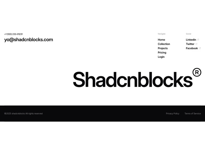
The upper area splits into contact information on the left (a phone number in medium text and an email address at a large display size) and two columns on the right labeled "Navigate" and "Social" with small muted headings. Navigation links are set in large semibold text, while social links include a small CircleArrowOutUpRight icon that shifts from muted to foreground on hover. Below, the brand name renders at viewport-relative sizing (13vw on mobile, 10vw on desktop) with a registered-trademark superscript in light weight. A dark-themed bottom bar holds muted copyright text and legal links.
The viewport-scaled brand typography is the standout element, stretching the name across nearly the full container width. The dark bottom bar forces its own theme, creating a distinct visual band at the very bottom. Social link icons use a grouped hover pattern where the icon transitions independently from the text.
The combination of oversized brand text, large email typography, and a dark legal strip gives this footer a confident, studio-quality presence. It reads more like a branded closing statement than a utilitarian link collection.
On smaller screens the contact and navigation columns stack vertically. The brand name scales naturally with the viewport width, maintaining its full-bleed proportions. The dark bottom bar stacks its contents and increases height to accommodate the vertical layout.