Footer 31 block design & features
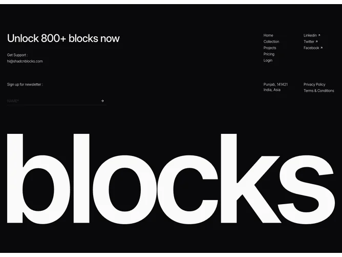
The Footer31 component is designed to provide a comprehensive footer block, enhancing a website's navigation and user engagement capabilities. It organizes content logically with sections for navigation, social media, contact information, and a newsletter sign-up form. The footer's layout is crafted to maintain clarity and usability, making it beneficial for sites that require a structured approach to their informational architecture.
The footer component is a detailed shadcn block that allows users to interact with a website's footer through various channels. It includes navigation links for seamless access to different website sections and visually emphasizes key points such as unlocking "800+ blocks" from the site. By incorporating social media links with small visual enhancements, such as arrow icons, it subtly encourages user interaction. The component also houses a newsletter sign-up form, facilitating user retention and engagement by allowing visitors to subscribe easily. Additionally, a concise geographical contact location is provided, enhancing the component's overall utility.