
Footer 21 block design & features
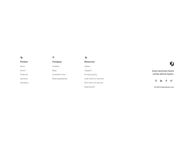
A five-column grid holds three navigation sections, each topped with a small decorative SVG icon and a bold section title (Product, Company, Resources). Links appear as muted text with a foreground-color hover transition. The last two columns collapse into a single right-aligned area containing the site logo, a short philosophical tagline, a row of ghost-variant Shadcn UI social buttons, and small copyright text.
The small SVG icons above each section heading are purely decorative, adding a visual marker that distinguishes this footer from text-only column layouts. Ghost-variant social buttons keep the icons lightweight, blending into the surrounding text. The tagline text uses base-size foreground color, giving it more visual weight than the muted navigation links.
The icon-per-section approach and the right-aligned brand column with its tagline give this footer a curated, editorial quality. The tagline adds a personal voice that most footer layouts omit.
On smaller screens the five columns stack into a single column, with each navigation section appearing in full width. The brand column shifts from right-aligned to left-aligned and appears last in the stack.