Shadcn UI Footer Block
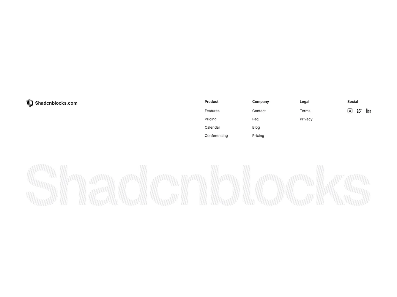
The Footer11 component is a versatile design block that organizes different sections and resources at the bottom of a webpage. It serves as an essential navigation point, providing users with links to various parts of a website such as product details, company information, and legal disclaimers. The component is structured to enhance user experience by presenting information in a straightforward and visually appealing manner, making it easy for users to access crucial details quickly.
In detail, the Footer11 component is crafted to refine the overall accessibility and usability of the website through its structured layout. The component is compartmentalized into sections that include Product, Company, and Legal, each containing relevant links for user access. The addition of Social links, represented by icons for Instagram, Twitter, and LinkedIn, enriches the user interface with options for engaging with social media platforms directly. This shadcn component's adaptability allows for integration of a specific logo, customizing the footer to align with brand identity while maintaining a consistent user experience.
Dependencies
| Package | Type |
|---|---|
| lucide-react | NPM |
