
Footer 6 block design & features
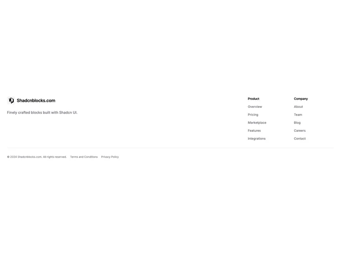
The layout splits into two halves. On the left, a small logo icon sits inside a rounded accent-background container next to a semibold title, with a descriptive paragraph below. On the right, up to two link columns appear in a responsive grid, each with a small semibold heading and a vertical list of muted-color links. A Shadcn UI border-top row at the bottom displays copyright text and legal links in extra-small type.
The logo icon container uses the accent background token with rounded-md corners, giving it a badge-like quality. The description paragraph uses base-size muted text, and link hover states transition to the primary color. The bottom row keeps everything at an extra-small font size, letting it recede visually below the main content.
This is a compact, understated footer that prioritizes brevity. The two-section split keeps branding and navigation clearly separated without requiring a multi-column grid, making it well suited for pages that need a lightweight footer.
On narrower screens the two halves stack vertically, with the logo and description appearing above the link columns. The link columns also stack to a single column on very small viewports.