
Footer 5 block design & features
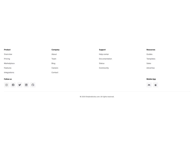
The top section arranges up to four titled link columns in an equal-width grid. Below it, a second row splits into two areas: a wider section labeled "Follow us" displaying social media icons inside small rounded-square muted containers, and a narrower "Mobile App" section with Android and Apple icons in the same container style. A border-top line separates these from centered copyright text at the bottom.
Icon containers use the muted background token with rounded-sm corners. On hover, the icon color transitions to primary while the container stays the same, creating a restrained interactive feel. Section labels are set as small semibold text with tight tracking, matching the heading treatment in the link columns above. All link text is small, muted, and medium-weight with primary-color hover states.
The overall composition is straightforward and grid-driven, with clear horizontal bands for links, social engagement, and legal information. The icon containers in both the social and app rows share identical sizing and shape, giving the lower section visual consistency.
On smaller screens the four link columns collapse to a two-column grid, and the social and mobile app rows stack vertically while maintaining their internal horizontal icon arrangement.