Footer 1 block design & features
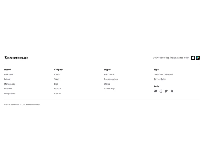
The Footer1 component serves as a comprehensive footer section for a web application, providing an organized structure of essential links and information. Designed to enhance site navigation, it integrates a logo, various categorized sections with key links, and social media icons, fostering user engagement and accessibility. This shadcn component is particularly well-structured for applications requiring a detailed footer with multiple categories.
Delving deeper into its design, the component encompasses three main sections: Product, Company, and Resources, each populated with relevant links that users might seek. This layout is enhanced by the inclusion of social media links represented by iconic symbols, which are easily recognizable and contribute to a modern web design aesthetic. Additionally, the component is laced with separators that visually delineate sections, ensuring clarity and improved user navigation. The shadcn block structure and its cohesive integration of a logo reinforce brand identity throughout the user experience.