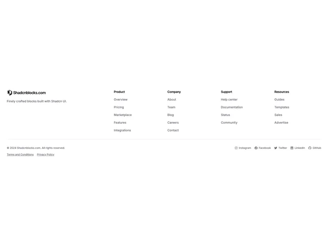
Footer 55 block design & features
The Footer55 component follows the familiar shadcn/ui marketing footer grid: a wide brand column with logo and description only, then up to four titled link columns with small body type and primary-colored hovers. Social entries from the shared pack sit in the bottom band with copyright and legal links: each renders as an anchor with the pack icon at reduced size and the human-readable label text. That keeps networks scannable as text without changing the underlying socialLinks shape.
The bottom strip uses two rows: copyright and labeled social links share one row with space-between alignment so copy stays left and socials stay right, wrapping on narrow widths. Legal links sit on the next row, left-aligned, with a modest top margin below the copyright and social row and underlined hovers.
Visually the block stays quiet and typographic; the labeled social entries use the same extra-small scale as the legal row within one bordered meta band.
On mobile the main grid collapses to two columns before expanding on large screens; the meta band keeps the same two-row structure.