
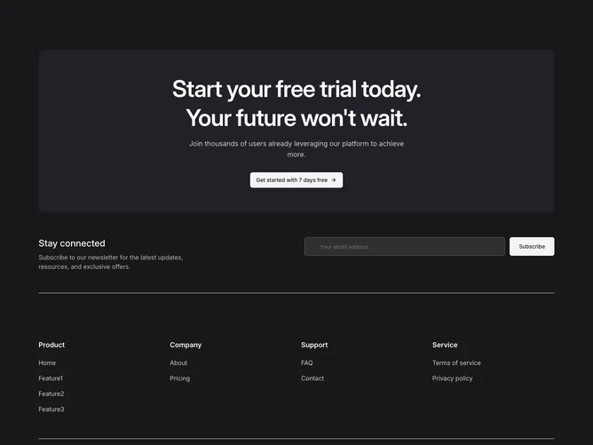
Footer 13 block design & features
The entire section uses the primary background color with primary-foreground text. At the top, a frosted-glass panel with a backdrop blur contains a large balanced heading, supporting text, and a secondary-variant shadcn/ui button with an animated arrow icon. Below this, a two-column newsletter area pairs descriptive text with an email input and subscribe button styled to match the inverted color scheme. A bordered navigation grid holds four columns (Product, Company, Support, Service) of link lists. The bottom row carries copyright text and a row of social media icons.
The frosted CTA panel uses a semi-transparent foreground background with backdrop blur, creating a layered glass effect against the primary surface. The heading is set at a large display size with text-balance for even line wrapping. Button hover states animate the arrow icon to the right. Social icons in the bottom bar use reduced opacity that increases on hover.
The inverted color scheme and frosted panel give this footer a bold, conversion-focused presence that reads more like a landing page section than a traditional footer. The newsletter and four-column nav grid beneath anchor it back to standard footer conventions.
On smaller screens the CTA panel and newsletter area stack vertically, the four link columns collapse to a two-column grid, and the bottom row arranges copyright and social icons in a vertical stack.