
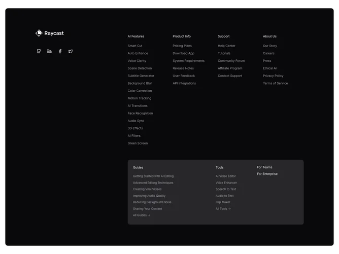
Footer 19 block design & features
The section forces a dark theme with rounded corners and generous padding. A left-third column holds a logo image, a row of ghost-variant social icon buttons, and small copyright text. The right two-thirds contain two navigation tiers stacked vertically. The upper tier is a four-column grid (AI Features, Product Info, Support, About Us) with small muted text links. The lower tier sits inside a rounded muted-background panel and uses a three-column layout for Guides, Tools, and a pair of standalone links (For Teams, For Enterprise). Some links in the lower tier include a small ArrowRight icon.
The forced dark background with rounded corners gives the entire footer a card-like appearance when the page is light-themed. The lower navigation panel uses a slightly lighter muted surface to create a subtle two-tone hierarchy. Links are set in small muted foreground text without hover color changes, relying on the cursor and underline for interaction cues. Arrow icons on "All Guides" and "All Tools" links signal that those items lead to index pages.
The two-tier navigation pattern allows a large volume of links to be organized without overwhelming the user. The highlighted lower panel visually separates guides and tools from the primary navigation, suggesting they serve a different purpose.
On smaller screens the left and right columns stack vertically, and the four-column grid reduces to two columns. The lower panel collapses its three-column layout to a single column.