Footer 9 block design & features
The Footer9 component is a well-organized footer block designed to enhance both navigation and user engagement in applications. By incorporating multiple sections such as Product, Resources, Case Studies, and more, it facilitates seamless access to various areas of a site or app. This shadcn component stands out by offering call-to-action buttons, a prominent signup section, and elegantly arranged links, ensuring that users can quickly access the features they need and engage with the brand.
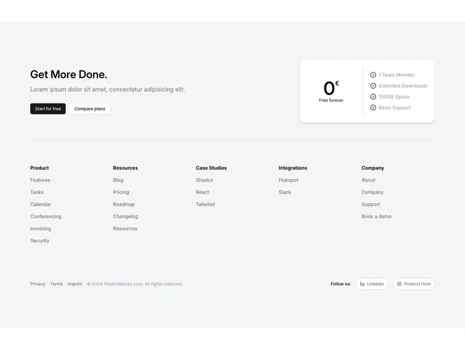
In detail, Footer9 offers a structured layout with specific sections that can hold important site links and information. The footer starts with a prominent call-to-action area, featuring bold typography and buttons, directing users to sign up or explore plans. It contains a visually appealing card showcasing a "Free forever" pricing model, enhancing its utility as a shadcn ui component aimed at conversion. The footer is smartly divided into several columns, each bearing a title and set of links. These sections allow easy extension and adaptability, ensuring the block can grow with the application's needs. The component also includes icons for external links, like LinkedIn and Product Hunt, enhancing social connectivity.