Footer 14 block design & features
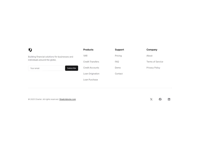
The upper area splits into two halves separated by a bottom border. The left half holds a logo image, a descriptive paragraph, and an inline email input with a subscribe button using native HTML elements styled to match the theme. The right half presents three navigation columns (Products, Support, Company) in a responsive grid with semibold headings and muted link text. Below the border, social media icons in circular hover-highlighted containers sit alongside copyright text.
Social icon buttons use rounded-full padding with a muted-to-accent background transition on hover. The newsletter input and button match the theme's standard form sizing, with the button using the primary background and foreground tokens. Navigation links use muted foreground text that transitions to the standard foreground on hover, with an active state shifting to primary.
The split between branding plus newsletter and navigation columns creates a clear functional division within a single footer section. The native HTML form elements rather than Shadcn UI primitives give the input and button a slightly more utilitarian appearance.
On small screens the left and right halves stack vertically, and the three link columns collapse to a responsive grid that shifts from three to two to one column as the viewport narrows.