Footer 62 block design & features
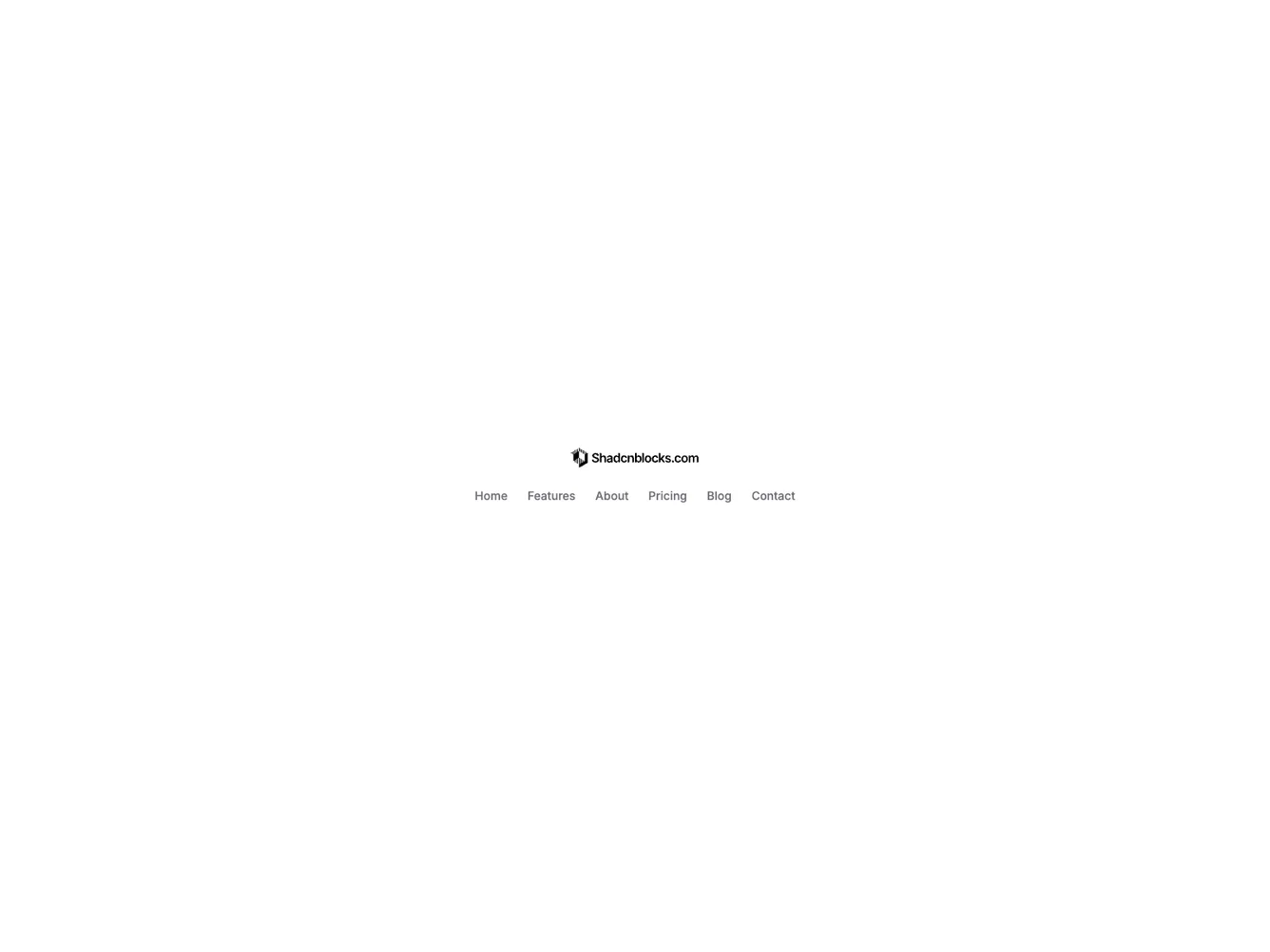
The Footer62 component strips the compact footer down to logo and menu links in defaults: social, copyright, and legal are cleared in defaultProps so previews read as a pure nav strip. The wordmark sits centered on top; the menu wraps below with centered alignment, and optional social icons appear as a third centered row when passed via props.
The block still consumes the shared footer-compact pack’s first section (three to six links) and is appropriate for admin chrome, docs sidebars finished with a slim bar, or anywhere social and legal clutter would feel wrong.
Spacing and hover behavior align with shadcn/ui compact footer siblings; complexity is low because the default markup omits optional regions entirely.