
Footer 25 block design & features
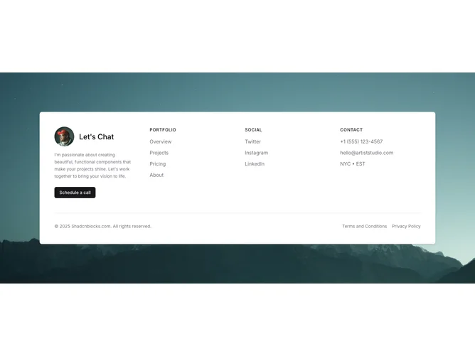
A full-width background photograph fills the section. Centered on top of it, a rounded white card with shadow contains a four-column grid. The first column shows a circular profile avatar, a "Let's Chat" heading, a personal message paragraph, and a shadcn/ui button. Two middle columns hold titled link lists (Portfolio, Social) with uppercase primary-colored headings and muted link text that gains a primary-color bottom border on hover. The fourth column displays Contact details (phone, email, location with timezone) under the same heading style. A border-top row at the card bottom carries copyright and legal links.
The background image uses cover sizing and center positioning, creating a photographic backdrop that peeks around the card edges. The card itself uses standard background and shadow tokens, providing strong contrast against the photo. Link hover states add a border-bottom in the primary color with a smooth transition, giving interactions a refined underline effect. The CTA button uses default primary styling.
The background-image-plus-card pattern creates a layered, high-impact footer that feels more like a contact section than a traditional footer. The profile avatar and personal message add a human, approachable element.
On smaller screens the four-column grid collapses to two columns and then to a single column. The background image remains full-bleed at all sizes, and the card maintains its rounded corners and padding.