Footer 17 block design & features
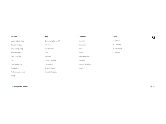
The Footer17 component serves as a versatile and interactive footer element for applications, enhancing navigation and connectivity through a comprehensive set of links and social media integration. The component is designed to offer structured navigation by categorizing links under specific sections like "Solutions," "Help," and "Company," while also providing users access to essential social platforms. It stands out as a shadcn ui component, offering an aesthetically pleasing and user-friendly interface that complements the overall design of an application.
In greater detail, Footer17 incorporates several interactive UI elements such as drawers and dropdown menus to organize sub-navigation links elegantly. The component adapts to user preferences through a theme toggle, which allows users to switch between light, dark, or system-defined themes. This adaptability is highlighted by the shadcn block design approach, which focuses on creating a customizable and responsive user interface. The presence of both external and internal links ensures that users have seamless access to various resources and social media channels directly from the footer, setting it apart from more static footer designs.