
Integration 13 block design & features
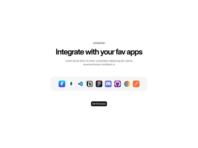
Integration13 is a centered section with a pill-shaped label, large heading, subtitle, and a dock-style row of nine app icons housed in a rounded muted container. Each icon links to an external page. Below the dock, a shadcn/ui Button provides a call-to-action. The dock uses Framer Motion to animate icon size and vertical position based on cursor proximity.
Icons are rendered as square images with rounded corners inside a muted-background tray. On hover, nearby icons scale up in width and height while lifting vertically, using spring physics for smooth transitions. The overall palette is neutral with a muted pill label and muted-foreground subtitle. The heading is large and tightly tracked.
The style is playful and interactive, borrowing directly from the macOS dock interaction pattern. The spring-based magnification gives the block a polished, app-like feel with higher complexity than a static logo grid.
On mobile, the dock is hidden and icons display in a simple wrapped grid with uniform sizing and a subtle scale-up on tap.