
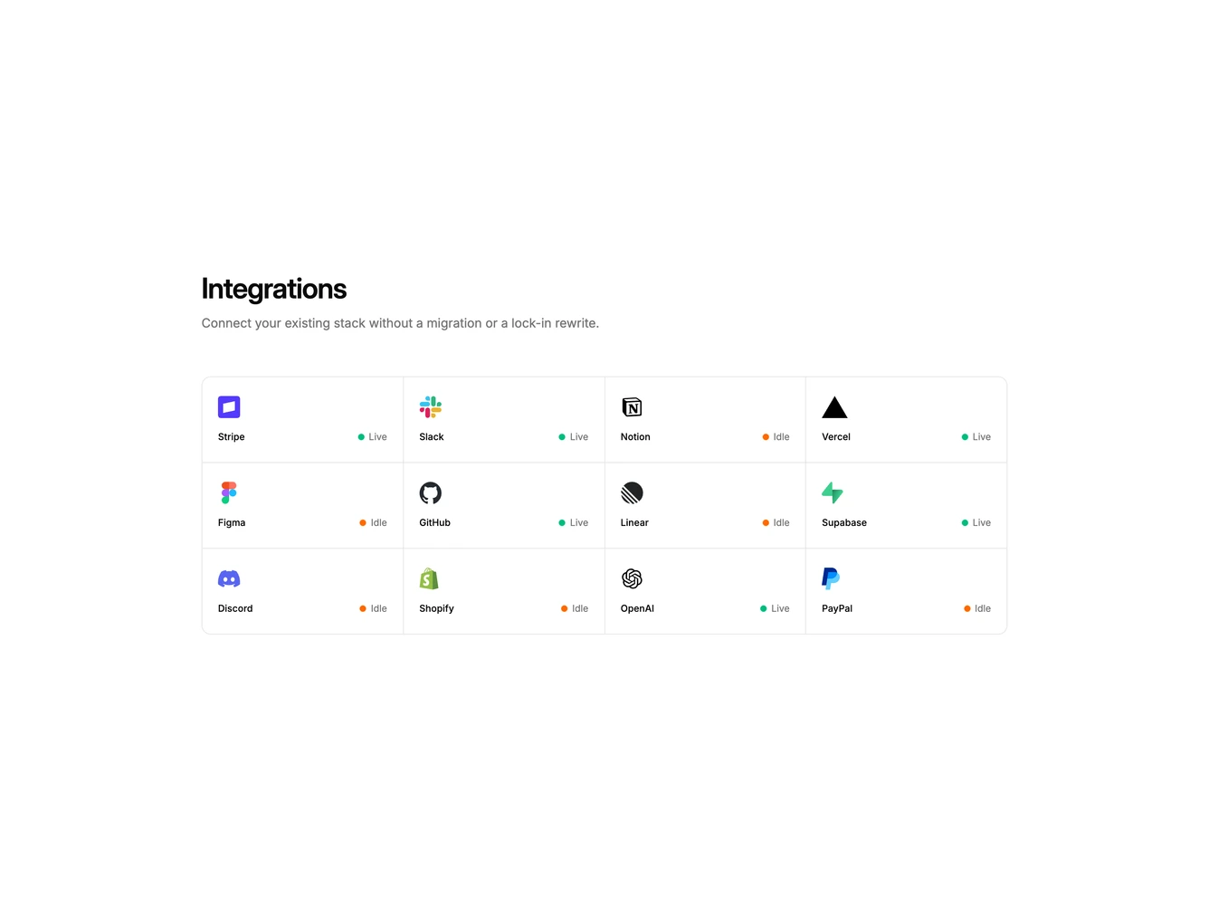
Integration 17 block design & features
Integration17 is a technical logo grid built with shadcn/ui Dialog, Switch, Input, Label, and Button. A heading and short paragraph introduce twelve rectangular partner cards in a single hairline panel. Each card shows a logo, the product name, and a live or idle status with a small glowing status dot. Click opens a dialog with that partner's name, matching live or idle status, description, an enable switch, a webhook field, event toggles, and disconnect or save actions.
Cards share one bordered shell split by one-pixel gutters rather than separate rounded tiles. Hover is a muted fill only. Live uses a subtle green glow; idle uses a subtle orange glow. The same status sits beside the name in the dialog and updates when the enable switch changes.
This is an interactive directory rather than a static trust strip. Complexity is moderate and mixed: the grid is image-driven while the dialog is a working settings form.
On small screens the grid is two columns, then three, then four. The dialog stays a single column.