
Integration 27 block design & features
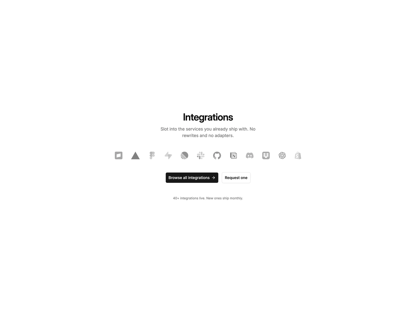
Integration27 is a centered logo cloud built with shadcn/ui Button, Dialog, and Radio Group. A heading and short paragraph sit above a wrapping row of grayscale logos that regain color on hover. Clicking a logo opens a dialog with that tool's mark, bordered view-only or full-access rows, and cancel or connect actions. Two catalog links follow, browse and request, with a small footnote under them.
The layout is typographic and open. Logos stay quiet until hover. Only the primary button has an icon so the pair stays hierarchical. The dialog is a single column with a small bordered logo tile above the title.
This is a classic marketing logo cloud with a working connect flow on each mark. Complexity is low and mixed: the strip is image-driven while the dialog adds a short authorization form.
Logos wrap on small screens and the buttons stack, then sit in a row. The dialog stays a single column.