
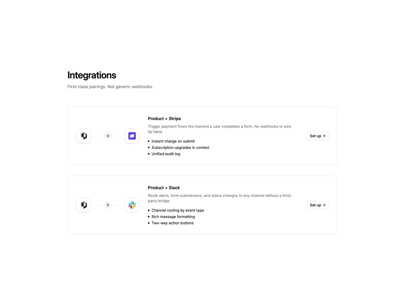
Integration 25 block design & features
Integration25 is a pairing layout built with shadcn/ui Button, Dialog, Input, Label, and Switch. A heading and supporting line introduce stacked cards. Each card shows two logo tiles joined by a line and a small zap icon, then a pairing headline, short copy, three benefit bullets, and an outline setup action. Clicking set up opens a dialog for the destination integration with that tool's logo, a destination channel field, a backfill switch, and cancel or connect actions.
Cards are bordered and roomy. The connector visual is the distinctive piece; copy stays secondary. Bullets use a primary-color dot instead of check icons. The dialog is a single column with a small bordered logo tile above the title. After connecting, the card button switches to a connected state and the dialog can disconnect.
This is a first-class pairing pattern rather than a generic logo cloud. Complexity is moderate and content-driven: each pair needs two logos, copy, and bullets, plus a working connect form for the destination tool.
On smaller screens the connector stacks above the copy and the button sits under the list. The dialog stays a single column.