
Integration 34 block design & features
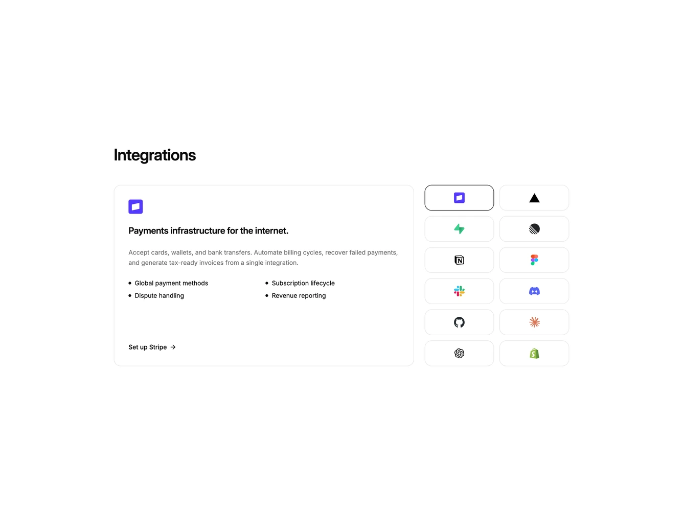
Integration34 is a featured-plus-grid layout built with Shadcn UI Button, Dialog, Input, Label, and Switch. A heading introduces a two-part grid. The large card spans two columns with a square icon, tagline, description, four highlight bullets, and a setup action. The remaining column is a dense grid of square partner icons at full opacity. Clicking an icon updates the featured card. Setup opens a dialog with a sandbox switch, an API key field, and cancel or connect actions.
The featured card is spacious and copy-forward. Icon tiles stay square with a stronger border on the active tool. Hierarchy comes from the span, not from extra color. The dialog is a single column with a small bordered logo tile above the title. After connecting, the setup label switches to a connected state and the footer switches to disconnect and done.
This is a marketplace highlight rather than an equal logo cloud. Complexity is moderate and mixed: one featured object driven by the icon picker, plus a per-tool sandbox and key form.
On small screens the featured card stacks above a three-column tile grid. At large breakpoints the tiles sit in two columns beside it.